
Graphs and curves surround us, whether we study psychology, economics, education, or public policy. These visual shapes do not merely decorate academic reports—they reveal profound truths about how the world works. From intelligence and income to happiness and crime, curves condense complex systems into clear insights. But only if we know how to read them.
This article walks through the most important curves used in human sciences, social statistics, physics, and mathematics. Each one represents a different pattern in the real world. Each one tells a different story. And each one applies in multiple domains. Once we understand what these curves mean, we begin to see the hidden structure behind modern life.
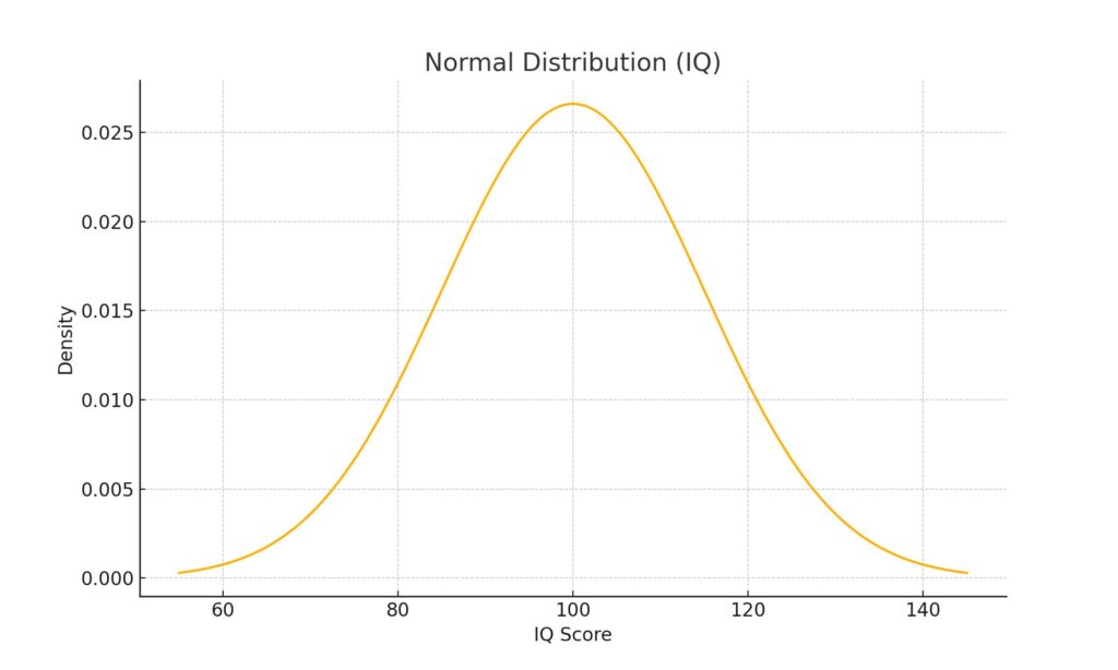
Normal distribution – the bell curve of intelligence
Let us begin with the most famous: the normal distribution, also known as the bell curve. Psychologists use it to model IQ. Most people score near the average (around 100), while very few score extremely low or extremely high. The curve is symmetric. It rises in the middle and falls gently at both ends.
This curve does not only describe IQ. It shows up in height, standardized test scores, measurement errors, and even some forms of reaction time. Wherever nature or society creates a central average with equal variation on both sides, we find the bell.
In education, schools assume most students fall near the center. In hiring, companies rely on the normal curve to interpret aptitude tests. And in healthcare, doctors use it to spot anomalies. This curve becomes a reference point. Anything too far from the middle often demands attention.
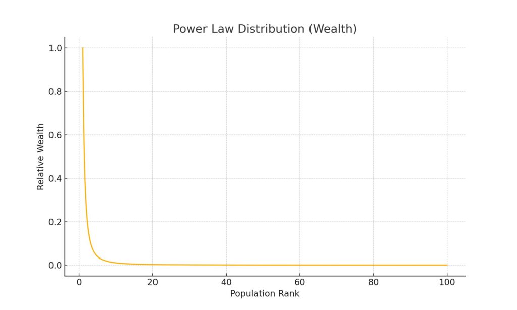
Power law – the wealth pyramid
Move to economics, and a very different curve dominates: the power law. This shape looks nothing like a bell. It starts high, then plunges fast, with a long tail stretching out. That tail hides a shocking truth: most people have little, but a tiny elite holds almost everything.
Wealth follows a power law. So does internet traffic, book sales, and even war casualties. This curve reveals deep inequality. It tells us that average wealth figures mislead. Most people sit far below the average, while billionaires distort the numbers.
In finance, the power law warns us about systemic risks. In politics, it explains why elites dominate policy. In media, it shows how only a few celebrities get attention, while millions remain invisible. Unlike the bell curve, this one demands structural reform.
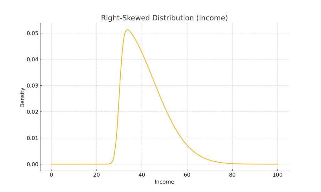
Right-skewed distribution – income’s silent distortion
At first glance, a right-skewed distribution looks like a tilted bell curve. It rises sharply, then falls slowly to the right. That long right tail changes everything. It means the majority earns below the average, because a few ultra-rich individuals stretch the curve outward.
Income behaves this way in most countries. While the median salary tells us what the typical person earns, the mean salary exaggerates it. Because of this skew, governments often misjudge poverty thresholds. Policies based on the average may exclude the actual majority.
Right-skewed curves also apply to housing prices, hospital stays, and company sizes. In all cases, a small number dominates the total. Interventions that ignore the tail usually fail.
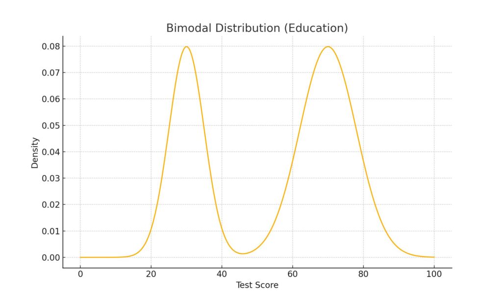
Bimodal distribution – educational inequality exposed
Now shift to a more complex shape: the bimodal distribution. This curve has two peaks. It suggests that a population splits into two distinct groups. In education, this pattern often reflects systemic inequality.
For example, privileged students in wealthy neighborhoods score well. Poor students in underfunded areas perform badly. The average may look fine, but the bimodal curve exposes a hidden divide.
We also find bimodal patterns in language proficiency, health outcomes, and even digital access. Whenever society leaves large groups behind, this curve emerges. It warns us that averages hide social fracture.
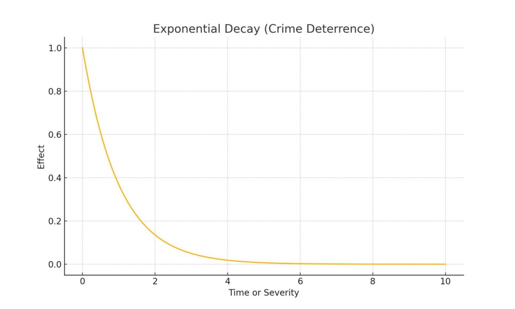
Exponential decay – the effect of time or deterrence
Turn now to exponential decay. This curve drops rapidly, then levels off. It tells us how things fade—whether attention, compliance, or survival.
Criminologists use this curve to model deterrence. As punishment becomes more severe, the additional deterrent effect decreases. A fine might prevent 80% of offenses, but doubling the fine only prevents a few more.
Survival analysis uses the same curve. Patients in critical care face high initial risk. If they survive the first phase, their chances improve. Exponential decay also models radioactive decay, memory loss, and online engagement. It explains how quickly systems lose intensity.
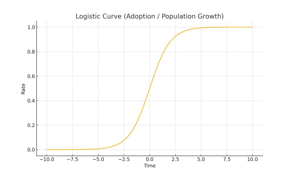
Logistic curve – growth with a ceiling
The logistic curve, or S-curve, starts slow, rises fast, then flattens. This shape describes adoption. New technologies, products, or ideas spread slowly at first. Then momentum builds. Eventually, saturation sets in.
Sociologists use this curve to track social change. Epidemiologists use it for disease spread. Businesses rely on it to forecast product life cycles. Unlike exponential growth, logistic growth recognizes limits—resource constraints, market saturation, or psychological fatigue.
The S-curve teaches us not to expect linear change. Revolutions accelerate, then stabilize. Populations rise, then plateau. Learning improves fast, then hits diminishing returns. This curve balances optimism with realism.
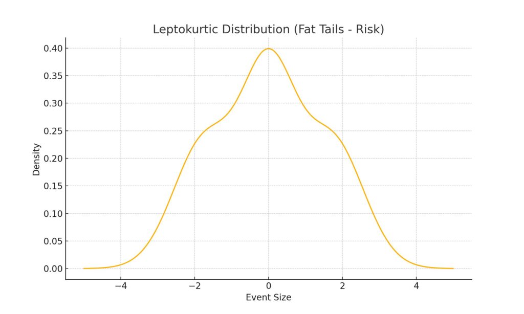
Fat tails – risk beyond normal
Return now to finance. Here we find the leptokurtic distribution, also called the fat-tail curve. It resembles a bell but has sharper peaks and thicker tails. Those fat tails matter.
Standard bell curves underestimate extreme events. Stock crashes, pandemics, or war outbreaks happen more often than the normal model predicts. Fat-tail curves capture that reality.
Risk analysts use these curves to prevent financial disasters. Insurance models also rely on them. Policy planners who ignore fat tails create fragile systems. This curve reminds us that rare events are not rare enough.
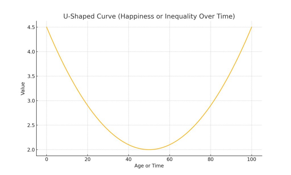
U-Shaped curve – life’s strange arc
In happiness research, economists often find a U-shaped curve. Happiness declines during midlife, then rises again in old age. The same pattern shows up in inequality studies—low at first, high in the middle, low again later.
This curve implies that life does not move in straight lines. Middle age carries stress, responsibility, and unmet expectations. Later, people often find meaning, even with fewer resources.
U-shaped curves appear in health, cognitive ability, and even political engagement. Policymakers must consider timing. Support at the right phase can change everything.
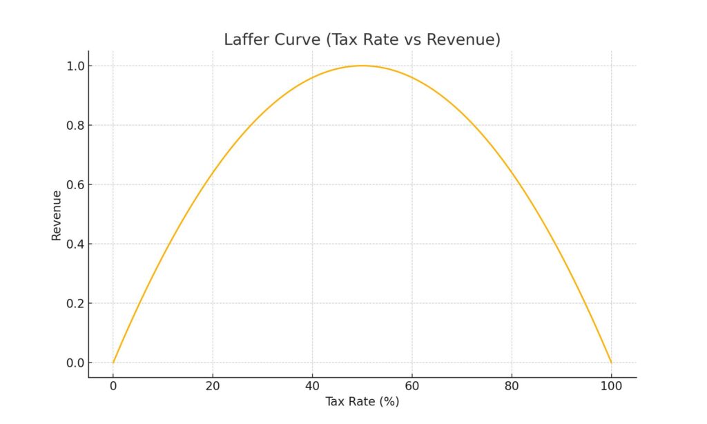
Laffer curve – taxing too much or too little
Public finance uses a clever idea: the Laffer curve. It suggests that tax revenue rises with tax rates, but only to a point. Beyond that point, higher taxes reduce revenue, either by discouraging work or encouraging evasion.
This curve became controversial in political debates. Some used it to argue for tax cuts. Others emphasized that the curve’s shape varies. Still, its insight holds: incentive matters. Revenue depends on behavior, not just arithmetic.
Governments use this curve to model fiscal policy. Economists apply similar ideas to regulation, fines, and subsidies. Everywhere incentives exist, Laffer’s insight applies.
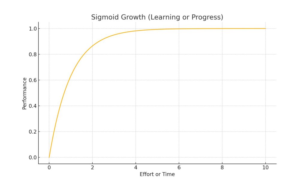
Sigmoid learning – effort’s reward curve
Finally, let us consider sigmoid growth. It resembles the logistic curve but emphasizes learning and mastery. Progress starts slow. Then it accelerates. Eventually, it slows again as gains require more effort.
In education, students struggle at first. With time, they improve rapidly. But later gains take hard work. In skill-building, this curve maps progress precisely. It also fits behavior change, therapy, and even moral development.
Learning platforms use sigmoid models to design curricula. Therapists apply them to recovery timelines. Political
activists use them to structure movements. Because change, like growth, rarely moves in straight lines.
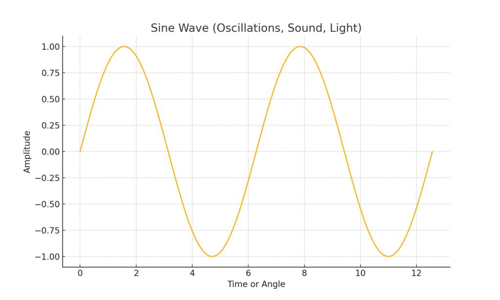
Sine wave – oscillations in nature
Physics offers the sine wave. It models sound, light, voltage, and any oscillating signal. It rises and falls in perfect periodic rhythm. Waves interfere, reflect, and resonate according to its cycle.
Engineers use sine curves in electronics. Musicians rely on it for acoustics. Physicists use it for wave mechanics. Whenever energy travels in pulses, the sine wave explains how.
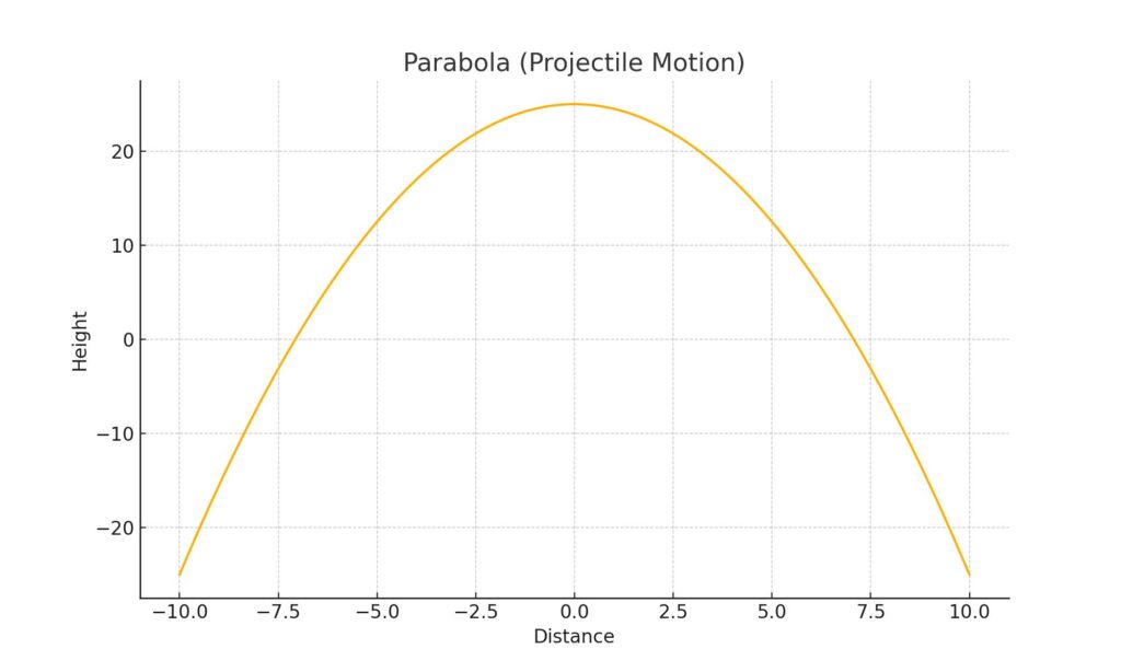
Parabola – projectile motion
Classical mechanics relies on the parabola. When an object launches under gravity, it forms this curve. It rises, slows, reverses, and falls symmetrically.
Ballistics, sports science, and civil engineering use parabolic curves to predict trajectories. In math, it represents quadratic functions. In physics, it explains gravity’s pull on motion.
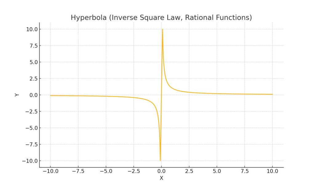
Hyperbola – inverse laws and relativity
The hyperbola shows up when forces or effects weaken with distance. For example, gravitational and electrical attraction follow inverse square laws. The closer you get, the stronger the effect.
In mathematics, it models rational functions. In physics, it appears in Einstein’s equations of special relativity. The hyperbola describes systems where intensity spikes near zero.
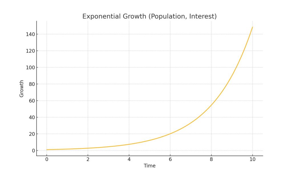
Exponential growth – explosions of scale
While decay slows over time, exponential growth accelerates. Each moment builds on the last. Populations explode. Compound interest multiplies. Diseases spread uncontrollably.
Biologists, economists, and data scientists all track exponential growth. It teaches urgency. What starts small can grow immense. Ignoring it causes disaster.
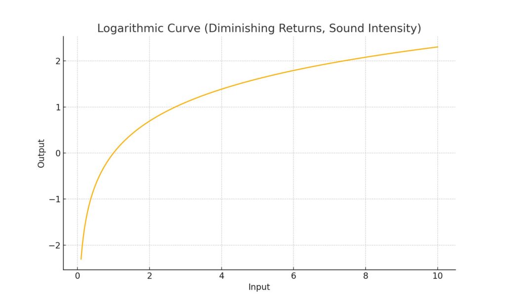
Logarithmic curve – returns that shrink
The logarithmic curve does the opposite. It rises fast, then slows. We see it in learning curves, sound intensity, and even perception.
Human senses respond logarithmically. Each increase in volume or light must be proportionally greater to notice. In psychology and economics, logarithmic curves model diminishing returns. They show that doubling effort does not always double output.
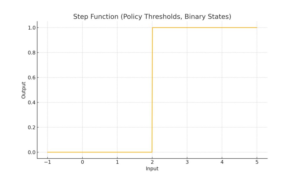
Step function
This curve jumps from one value to another without transition. It forms a flat line, then instantly shifts to a new level. Mathematicians call it “discontinuous,” but in society, it mirrors how many real-world systems operate. Law and policy rely heavily on step functions: the drinking age moves from illegal to legal overnight. A tax bracket may leap once your income hits a threshold. In computing, digital signals operate in binary—either 0 or 1, off or on. The step function models systems where gradual change does not exist. Instead, something either happens or it does not. It is the architecture of hard rules and instant consequences.
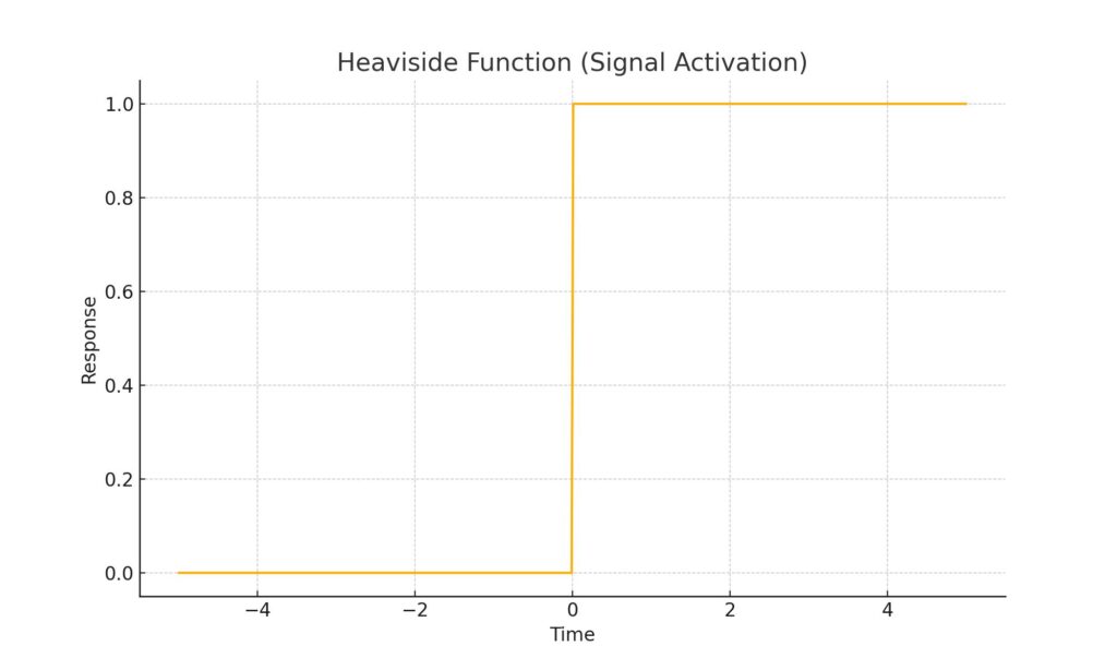
Heaviside function
The Heaviside function is a special kind of step function, used especially in physics and control theory. It stays at zero for a long time, then suddenly becomes one. Engineers use it to describe when a machine starts or when a signal arrives. In electrical circuits, it models a switch being flipped. In climate science, it can approximate tipping points—moments when a system snaps into a new state. The Heaviside function helps simplify complex behavior into controllable, timed phases. It makes invisible thresholds visible. It is ideal for studying systems that wait silently, then erupt into action.
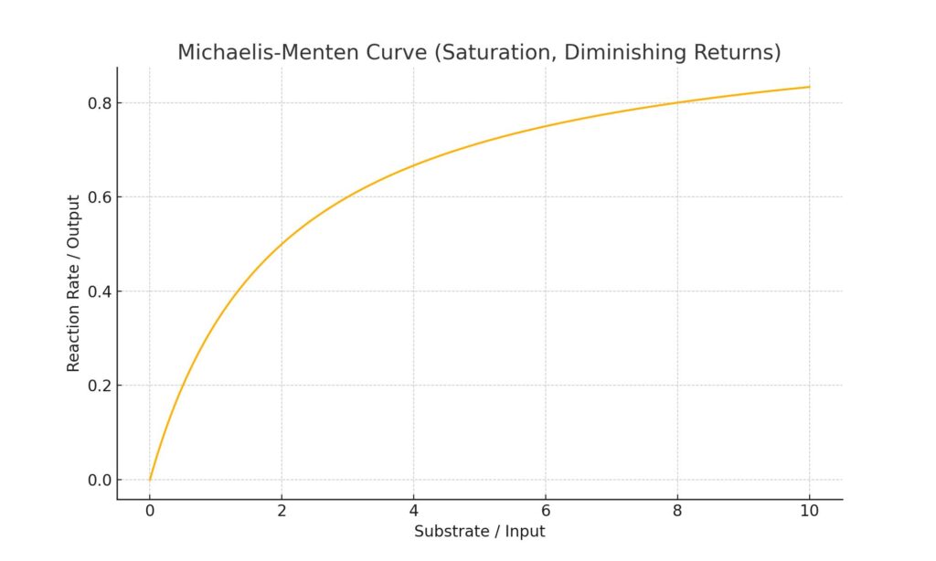
Michaelis-Menten (saturation curve)
This curve rises quickly at first, then slows down and plateaus. It was originally developed to explain how enzymes work in biology. When there are few molecules to process, enzymes work faster with every new addition. But after a point, they become saturated. No matter how much more is added, the system cannot go any faster. Economists later borrowed this curve to describe diminishing returns. For example, advertising might work brilliantly at first. But once you saturate your market, extra spending yields almost nothing. This curve explains why no system can grow forever—and why smart limits matter.
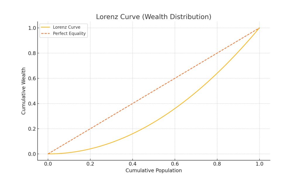
Lorenz curve
The Lorenz curve is central to understanding inequality. It does not measure income directly. Instead, it plots the cumulative share of income earned by the poorest x% of a population. In a perfectly equal society, this curve would form a straight diagonal line. But in reality, it bends downward, showing that the richest few control a disproportionate share of wealth. The more it bends, the greater the inequality. The area between the curve and the diagonal forms the basis for the Gini coefficient, a widely used inequality metric. The Lorenz curve visualizes what raw statistics often obscure: who owns what—and who is left behind.
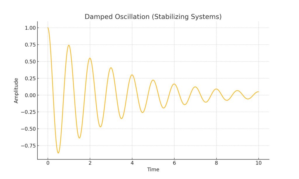
Damped oscillation
A damped oscillation combines two ideas: repetition and decay. It looks like a sine wave that slowly settles down. You see it when a door with a hydraulic closer swings open and then gently returns. You see it in financial markets that overreact, correct, and finally stabilize. You see it in bodies after injury or trauma—heartbeat, hormone levels, and even behavior pulse erratically before calming. The damping curve explains how systems return to equilibrium, not immediately, but rhythmically. Engineers use it to design shocks and suspensions. Economists apply it to boom-bust cycles. Psychologists observe it in emotional recovery. Where there’s vibration that fades, damping defines it.
Does this prove God?
Such stable patterns. Somebody must have done it. We perceive agency in things that are natural, given our evolutionary equipment. But even God needs abstract objects to exist and creating the world ex-nihilo requires physical laws for him to exist.
God cannot exist infinitely in time because he would have needed time to create himself. So he couldn’t have created time alone. The same goes for God being beyond time. Such a God wouldn’t be able to create the universe and so on. God can be eternal but cannot be creator of anything (including time alone). (250 Arguments for Atheism, Jan Bryxí, 2025)
Why do these curves matter?
These curves do more than explain numbers. They reveal the structure beneath social life. The bell curve shows us norms. The power law exposes elite concentration. The skewed curve uncovers silent injustice. The bimodal one reveals division. And the others—decay, growth, saturation, oscillation—tell us how systems move, stall, or spiral.
Once we learn to read them, we begin to think differently. We stop blaming individuals. We start spotting patterns. We stop trusting averages. We start asking better questions.
And that, ultimately, changes how we see the world.
Leave a Reply